Beautiful colours and high-quality finishes
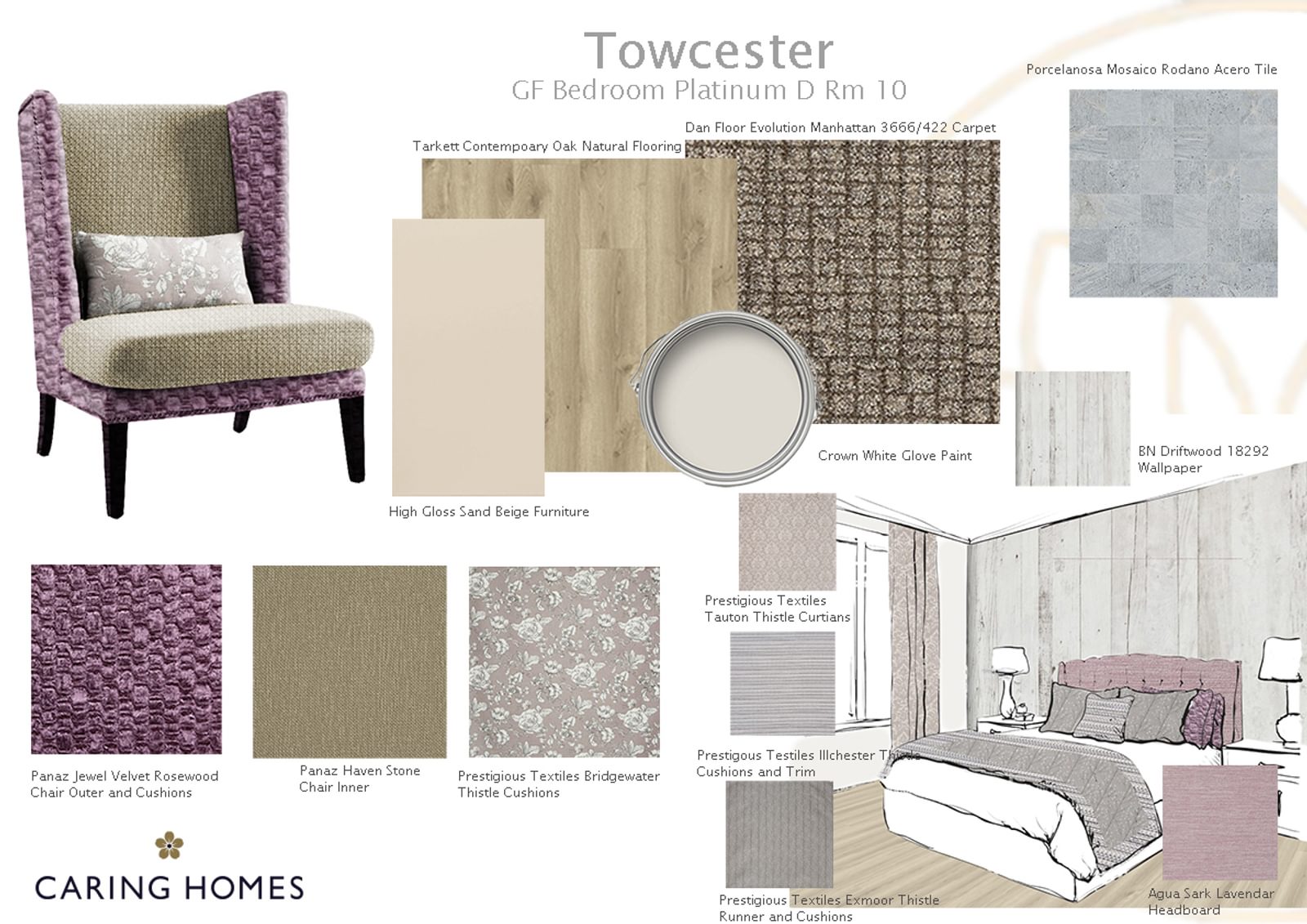
As soon as you step inside Brook House, in Towcester, you will see that the design, the colours and the luxury finishing touches have all been together with our residents’ comfort and safety in mind.
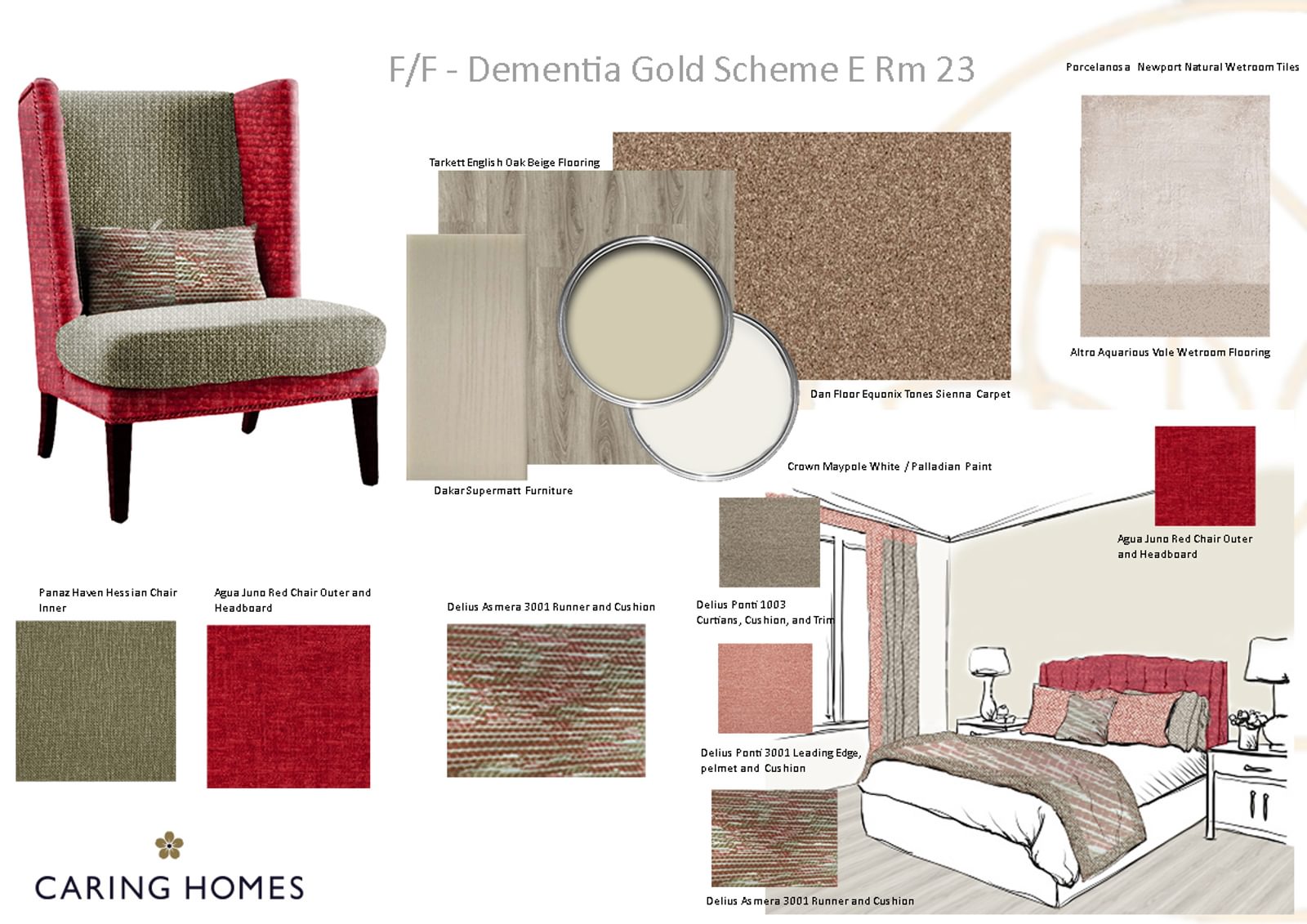
At Brook House the furniture, fixtures and fittings are similar to a high-end hotel with Porcelanosa wall tiles in the ensuites and Altro Aquarius safety flooring. A huge amount of thought and planning goes into the décor, the fittings and the finishing touches which all make the most of the design features of the building and help to capture the natural light.
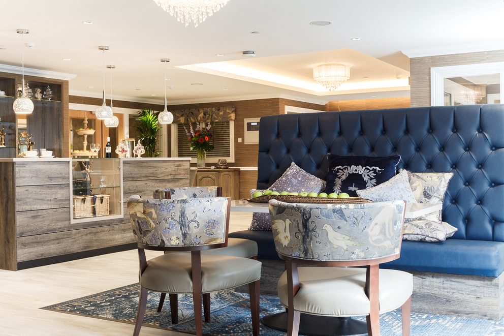
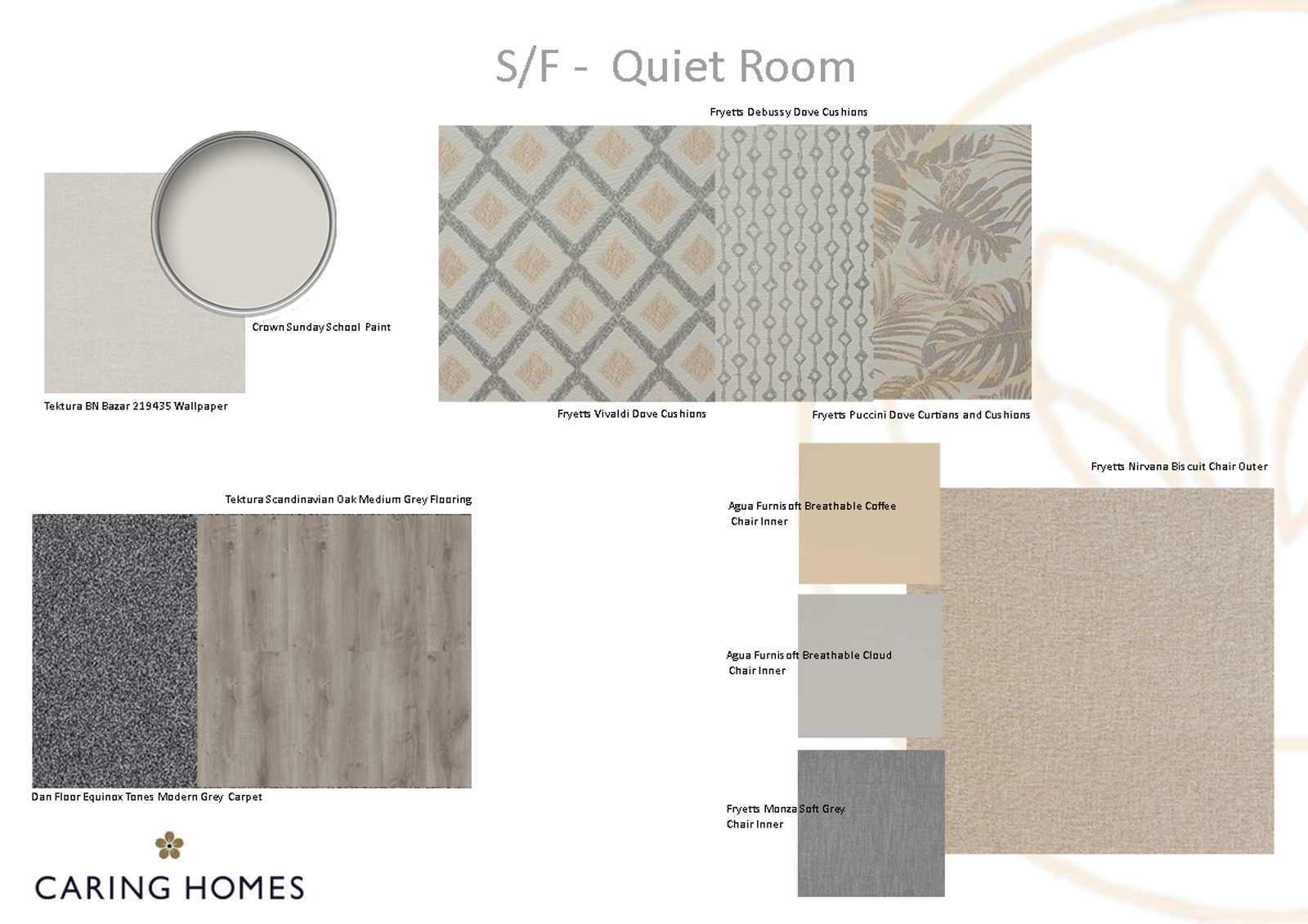
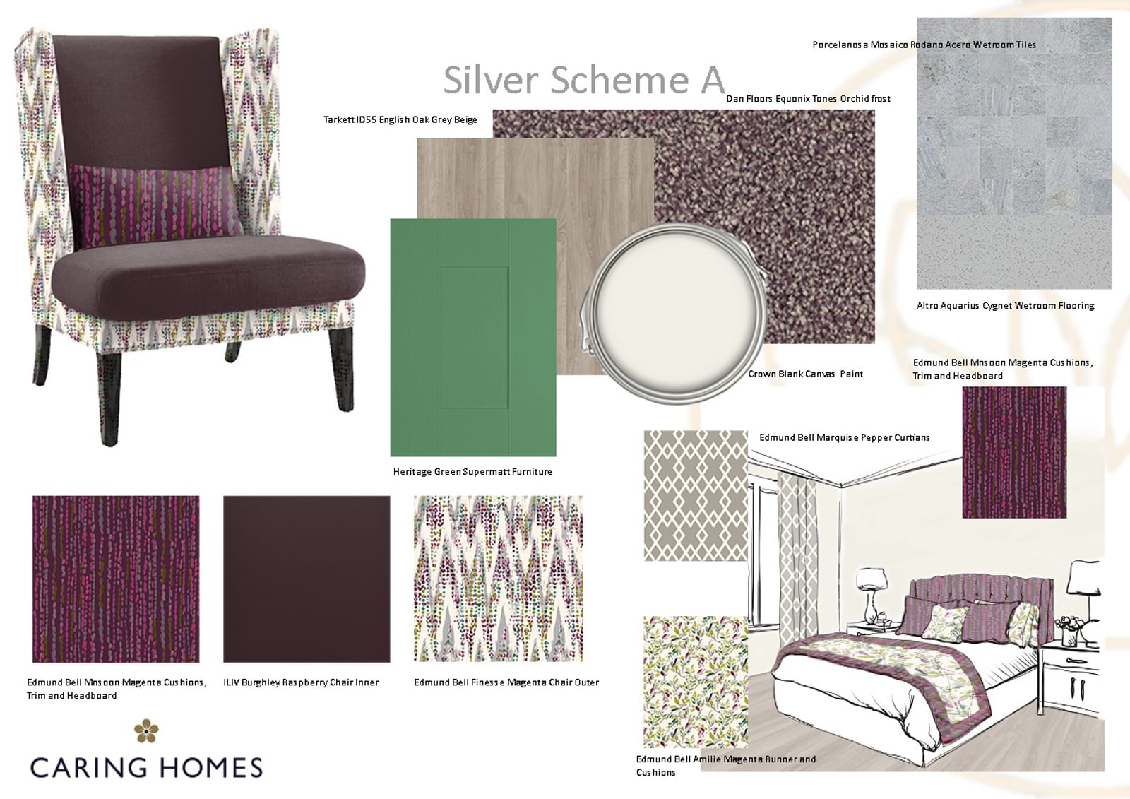
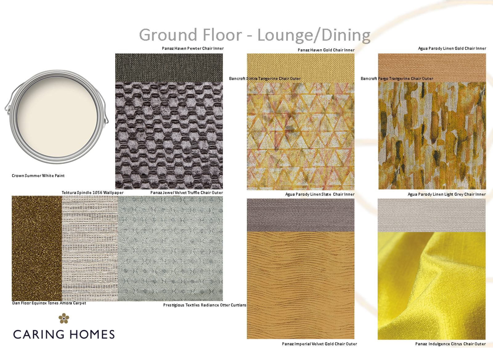
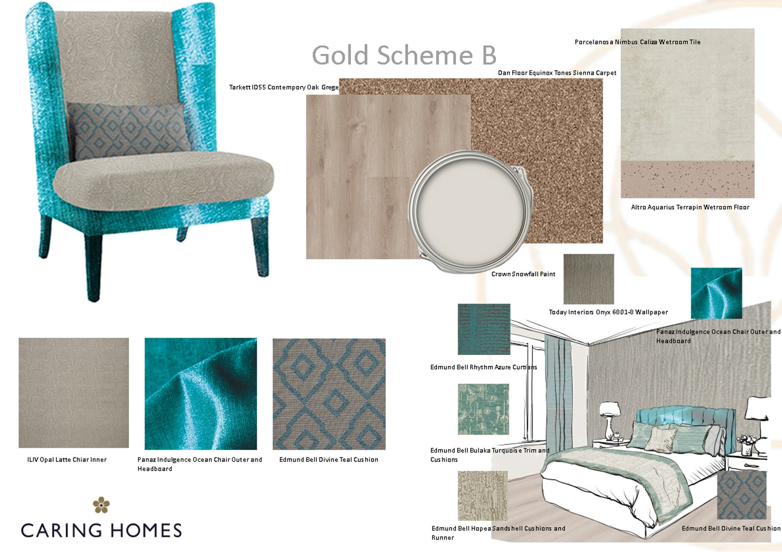
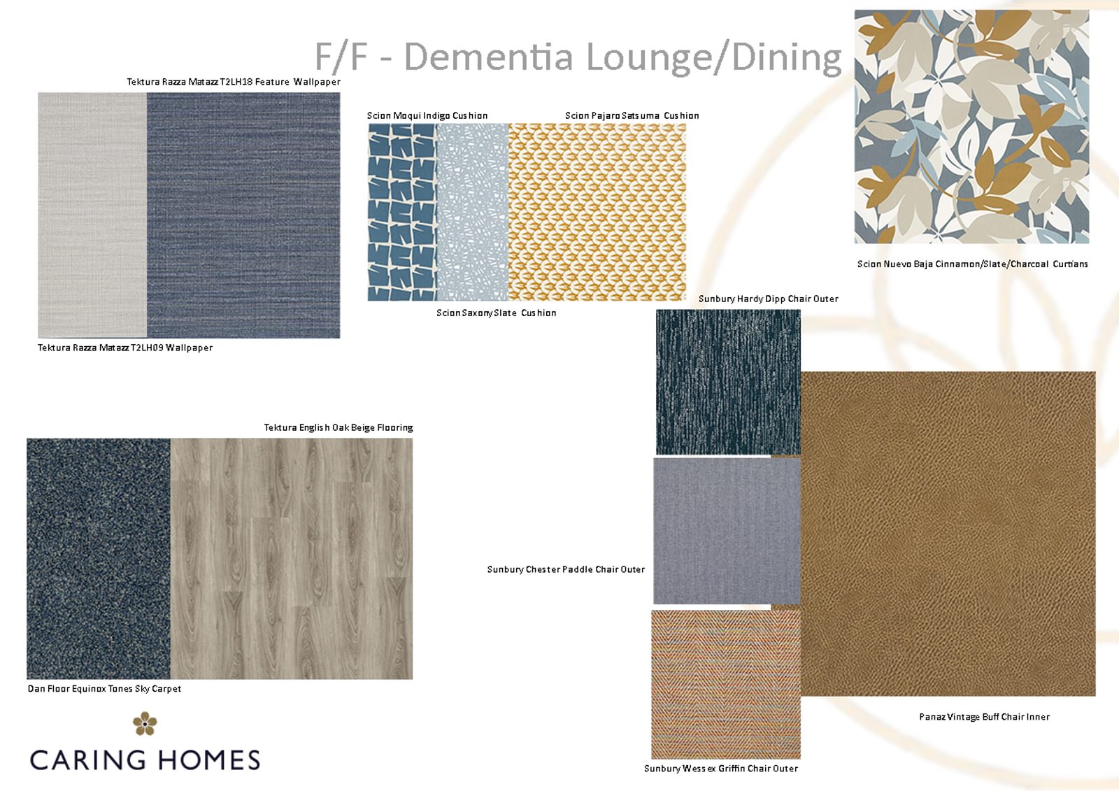
There’s dove grey and Scandinavian oak flooring in the Quiet Room, citrus and gold in the Dining Room. Beautiful jewel colours of red, turquoise and amethyst in the bedrooms are echoed in the runners and cushions. If you take a look at the mood boards put together by our interior design team and pictured here, you can get a real feel for the quality and contrasts you will find throughout the rooms at Brook House.
When considering colours for a care home it’s interesting to note that our perception of colour is governed by a combination of three factors – hue, saturation and tone. As the eye ages it loses some capacity to interpret some of these factors and we have to manage the materials we use to ensure our environments are easily understood by people living with older eyes or other visual impairment.
Hue is what we generally understand to be colour. The mix of red, green and blue that creates the dominant ‘colour’ of an object or surface. Saturation governs the depth and intensity of a colour. A bright green would have a high saturation factor, whereas a washed out grey/green would have a low saturation value. Tone governs the amount of light a colour reflects - what we perceive to be a light or dark colour. Tone is what creates contrast.
There is science behind the interior design of our homes and a lot of research has been done into finding the best for our residents, both by Caring Homes and more widely within in the sector. Our colours, patterns and finishes are carefully selected along with artwork and destination pieces to position at the end of a corridor or on a landing.
Both colours and contrast are especially important for those living with dementia as is lighting, directional signage and finishes – for example to highlight where a door is, to see what is inside a drawer or a cupboard or to easily find the toilet seat.
As with all things in life people will all have their own individual preferences so the many lounges and quiet corners in Brook House are decorated differently and there is sure to be one which will be a favourite to each individual and may become their preferred place for a cup of coffee and a chat with visitors, or a special seat to sit and read a book by the window
Personal items are encouraged in residents’ bedrooms to help them to setlle into their new home and rooms also have memory boxes which can be used to display special personal items and help to signpost an individual’s room for them.